Capital Office Products

Capital Office Products is an office supply company based in southern California. As a leader in its industry, the company provides clients with much more than just a catalog of products. The founders have more than 20 years of experience and handpick their teams to ensure each client receives excellent customer service while having access to knowledgeable people that are always available to them. Capital Office Products’ success comes from building long term relationships built on trust and reliability, as was evident when we discussed their client base and how long they’d been serving their oldest clients. As their company continues to grow they knew a new website would enable them to bring that level of customer service to their online presence. The former website was dated and didn’t provide enough information to prospective clients to be useful. When discussing other players in the industry, it became clear the client understood their strengths and wanted the new website to be an extension of their brand. This project was an opportunity to set them apart and give their audience an idea of the standards they could expect when choosing Capital Office Products for their supply needs.
We began with content strategy and created new content to provide their audience with detailed information about their various services. The content will play a big role in distinguishing the client from competitors, who tend to use their websites only for e-commerce. As we dove into Capital Office Products ‘why’ we saw that they truly go above and beyond to provide their customers with options that fit their needs and budgets. It was clear that this was the core element of their brand and the content needed to reflect it.
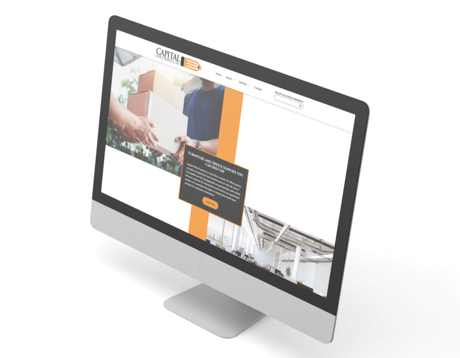
Capital Office Products had an extremely clear vision on what they wanted in regard to the website design. The main focus was to highlight both of their primary services right off the bat on the homepage--office supplies and furniture. We did this in a way that adhered to their expectations as well as kept in line with their brand guidelines. Their main focus was the imagery presented big and bold for people’s eyes to flock to, and to show them the extent of what they can offer.
When the design was approved we moved on to development. One of the elements included was a search engine at the top of every page for ease of access to every product in their inventory. We strived to make the transition smooth from the main website to their product site. As with all of our projects, we tested the website across multiple browsers and devices to ensure the website was accessible and working properly.
After standard testing was complete, the Capital Office Product team received training and tested the website for themselves. The website has been successfully launched and the client is pleased with the results. Through content strategy and a bold design, the project has accomplished the goal to set Capital Office Products apart from the rest.

Choosing someone to trust your website with can be difficult but 95Visual was absolutely the right choice. The 95Visual team prioritized my input and concerns, while providing the knowledge and fresh perspective the project needed.
