Blue River Pharmacy
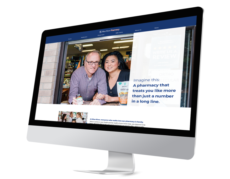
Blue River Pharmacy came to us to help with a refresh of their current website. The new goal of the website was to highlight three key items: everyone who comes in is like family, their friendly services, and the impressive product line-up. Following this was also an addition of a new online prescription form and other important forms about their patient information.
95Visual takes a content-first approach to all projects. We believe that cohesive, complete content is the first step to brilliant design and our clients find it helpful to see their content on the mockups during design. The content strategy process began with the Deep Dive Interview, in which our content strategist meets with client leadership and project decision-makers to establish how we can reach their target audience best. Following this discussion, we created a content strategy brief, which identified the project goals and included content architecture for a thoughtful and organized sitemap. The client met with our team to review those deliverables and give approval, then our content strategist began writing the new content. After the content has been approved by the client, it is reviewed by 95Visual's designer before the mockup kickoff call.
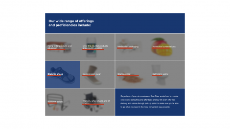
The style direction for this website came with a want to not alienate the client's (Blue River Pharmacy) visitors to their site and to create something new/current since their website at the time had been around since about 2014. Soon the discussion began on what direction to take with the design and how to make everything easier on potential and returning shoppers. Elements were given more space and photography took a bigger position to help guide shoppers visually throughout the new site. However despite the changes made, many items stayed such as: the primary color, the logo, and much more.
Montserrat
Image
Source Sans Pro
Image
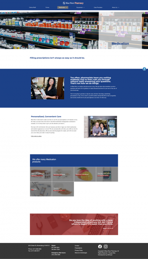
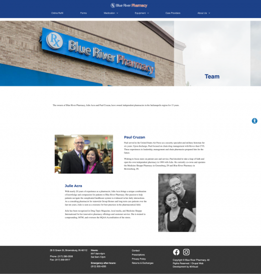
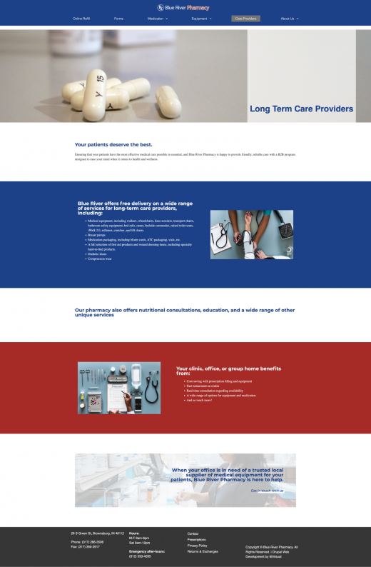
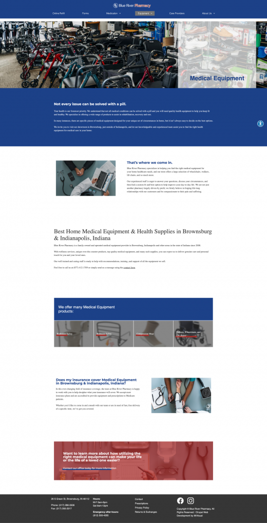
The design for Blue River Pharmacy focused on the idea ease of use for their current and potential shoppers. Specific content was also brought to the homepage to help with quickened navigation. Outside of those items, the remainder of the design was done through a close collaboration with 95Visual's design team and Blue River Pharamacy.
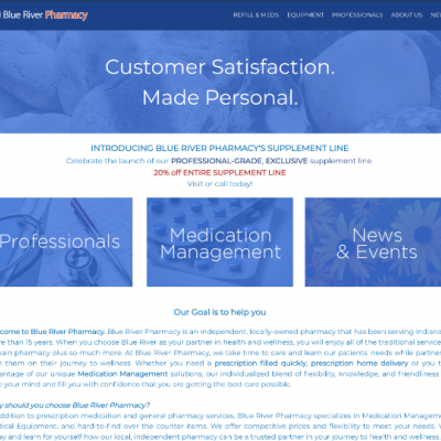
Shown above is the previous website design that was dated back to around 2014. It had an outdated layout and the ranking on Google had much to be desired.
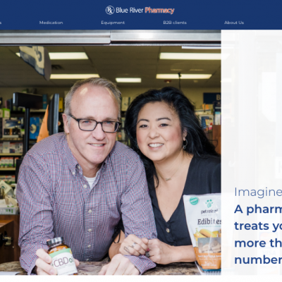
The new design was created with a close back and forth between Blue River Pharmacy's owners and the design team here at 95Visual. Focusing on space and products on the homepage were some of the bigger pieces requested for the site redesign.
After the content and design received final approval from the client, we moved on to the development and pre-launch stage. As with all 95Visual projects, we prioritize usability across all devices and tested the website across multiple browsers and mobile devices after the website was complete. Client training was provided and the website was successfully launched.

I’ve been doing business with 95Visual for 5 years and their expertise in website design and google search and optimization has propelled our business like nothing else. Can’t recommend them enough!
