Big IT

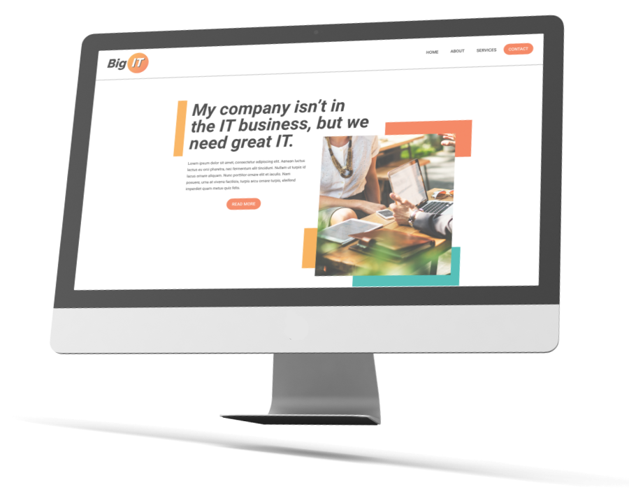
Big IT is a private Information Technology company that sets out to help clients find solutions through technology management. Their company goal is to provide a service to develop and manage IT systems and solutions, while also reducing companies overall IT cost.
This website is no longer in service.
Color was a big part for the branding as it can extend into all parts of the branding of the company. The choice for the Red-Orange and Orange was to be bold and memorable with the companies logo, as orange is not a widely use branding color. Orage also is a color that has a feeling of creativity and success which are two major qualities of Big IT. To contrast these two warm colors a teal was added to provide a softer diversity to page elements while maintaining a bold feeling.
Big IT wanted to create a brand that was relevant to today's world, something bold and creative, as well as a brand that felt established and professional. The choice was to go with something orange and bright and being by the sun this current logo was designed. The logo has a gradient of orange to a reddish orange to present a bold and powerful feeling to this logo similar to fire or the surface of the sun. The choice was made to use an italic font to give the logo a feeling of motion, as the company is always moving forward with new technologies.


